05 April 2023

Online kontroly (ROC) už aj na Slovensku!

Túto zimu sme s bratom Palom dali dokopy 3 kusy online kontrol pre orientačný beh. Tieto, a ešte dva mobily, sa zapojili do akcie počas víkendového CEYOCu, kde spolu za tri dni dopravili z trate do cieľa okolo 5 000 medzičasov pretekárov.

Napriek "garážovej výrobe" fungovalo všetko veľmi dobre a vďaka tomu to na zhromaždisku žilo, komentátori mali o čom rozprávať a podľa ich vlastných slov sa na šprinte 90 minút nezastavili. Takisto živé výsledky na internete mali medzičasy priamo z trate a nie až po dobehu pretekára do cieľa.

Ako vyzerá online kontrola?

Takto vyzerá krabička:


A tu sú dve umiestnenia krabičiek z víkendu:

Kábel z krabičky ide k senzoru, čo je pod SI jednotkou

Nájdite krabičku a senzor

Ak ju na druhej fotke nevidíte – je to tak dobre, ako pretekár by ste si ju nemali ani všimnúť a nemala by vám stáť v ceste.

Ak náhodou tento rok zakopnete o takúto krabičku alebo nebodaj kábel, tak ospravedlňte organizátorov, budeme sa s tým viacerí tento rok učit zaobchádzať a správne umiestňovať. Verím, že časom bude takýchto problémov ubúdať.

Ako to funguje?

Na konci kábla, čo najbližšie ku kontrole, je senzor od SportIdentu, čo zaznamenáva prebeh pretekára. SIAC funguje vždy, pre kontaktné čipy treba špeciálne krabičky s vysielačom.

Zo senzoru ide informácia do malého počítača Raspberry Pi, ktorý ju cez mobilnú sieť pošle cez internet do Švédska a odtiaľ sa už dostane do cieľa. Na počítači beží švédsky softvér ROC, ktorý sa používa aj na televízne prenosy z 10Mily.

Dať dokopy elektroniku nie je ťažké, návod je pomerne priamočiary. Ťažké je ale spraviť zariadenie odolným voči všetkým nástrahám, čo sa na pretekoch môžu vyskytnúť. Zároveň treba zladiť dve protichodné požiadavky na vodotesnosť a odvádzanie tepla. Väčšinou ak odvádzate teplo, strácate vodotesnosť a opačne.

Ak má niekto záujem, môže si poskladať vlastné zariadenie, vieme sa tiež podeliť so skúsenosťami.

Ďalší vývoj

Švédsky ROC je výborná vec, ale už teraz vidíme jeho obmedzenia a slabé možnosti rozšírenia. Napríklad malý informačný displej v krabičke by výrazne vylepšil narábanie so zariadeniami. Takisto chceme pridať iné komunikačné možnosti ako LoRa (rádiový prenos) alebo NB-IoT (sieť pre IoT zariadenia). S prvou technológiou experimenujú členovia ŠK Sandberg, s druhou my v Sokole.

Zároveň je dôležité znížiť oneskorenie z 10 až 20 sekúnd na 1 až 2 sekundy, hlavne pre kontroly v priestore zhromaždiska: zberka, cieľ alebo verejná kontrola. Na CEYOCu sme mali cieľ cez vlastný program (a nie ROC), ktorý dosahoval oneskorenie okolo jednej sekundy. Komentátor tak okamžite videl celkový čas dobehnutého pretekára.

Do budúcej sezóny dúfam stihneme väčšinu z týchto zlepšení, niektoré možno uvidíte už na jeseň.

29 August 2022

One month in North America

I’ve recently spent a whole month in North America, about half of it in friends' houses and the other half travelling around. I’ve made a lot of photos, some of which you can see in the latter part of the blog post, but first let me mention a few of my observations.

North America is becoming Europe and Europe is becoming North America

My first visit to USA was 16 years ago in 2006. I remember everything seemed bigger to me then: cars, meal portions or skyscrapers. Now it seems that cars are about the same size as in Europe and the same with meal portions. Regarding cars, it’s a a world-wide trend to make the same models bigger each year.

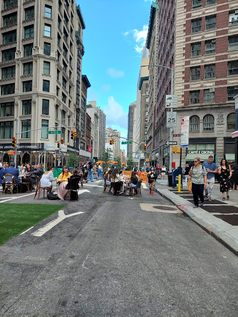
However, North America is also becoming more European, because cities are becoming more pedestrian- and bike-friendly. In 2006, I was overwhelmed by the crowds in New York. You couldn’t even stop at the sidewalk to look around, the crowd would push you. Now they have closed certain roads and made them into pedestrian zones. You can enjoy the city much more now, though there's still too much asphalt.

Parts of Brodway closed for pedestrians

And of course, then there is Burlington in Vermont, which seems to have had a pedestrian zone forever.

Burlington, the biggest surprise of the trip

Walking is more pleasant than 15 years ago, but what about cycling? Me and Aňa explored Montreal and New York on shared bikes. The bike infrastructure is good especially near water but in the inner city you have to stop about every 2 blocks (200 metres) on a red light. I saw a lot of progress but with this rate of progress, New York will be like Copenhagen in 30 years and like Amsterdam in 100. It seems Montreal will get there quicker.

Where North America is seriously lacking progress is public transport. It doesn’t seem to be getting better, they are building new projects at a very slow rate and they are expensive.

The above are only things you can observe as a tourist, so take it with a grain of salt.

Random observations from the trip

I don’t want to bore you with a retelling of the whole trip, so here’s a few more observations and then you can look at the photos.

  • National/state parks: USA takes really good care of their national and state parks. As a result, the US has some really nice forests where you can see a lot of wild animals. In Slovakia in 2022, we finally passed a law to forbid human interventions in large parts of all our national parks.
  • Burlington, Vermont: this city was the biggest surprise of the trip. It’s like Vermont’s Trnava: big pedestrian zone and a lot of great restaurants and coffee shops reachable by foot.
  • Inflation: inflation seemed to me about 50% since I visited the last time, at least for the things that tourists need: rental cars, restaurants and hotels. I’m not sure by the number 50% but according to my friend who tracks his expenses, this seems about right. And the weakening euro made this worse.
  • Maple syrup fudge: one of the most addictive things I know. Luckily, I can’t buy it where I live.
  • Culture in New York: I've been to New York twice before and this was the first I've been to a stand-up a Broadway show. There's nothing like it in Europe and I should have gone sooner!

Photos

I’ve made two bigger trips. The first was a camping and hiking trip to Catskills with Kolo, Liz and little Filip. Then when Aňa arrived, we went on a road trip from Boston to New Hampshire, Montreal, Vermont and back to Boston. We also visited New York just before flying back to Europe.

Here's link to a full album from all travels, a small selection of photos is included in the rest of the post.

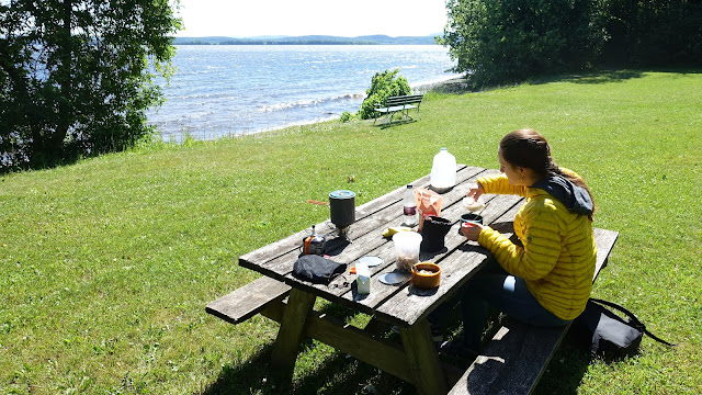
Eating at a lake

Campsite lake

Lake Champlain


Lake Champlain

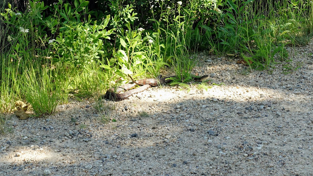
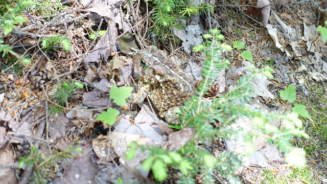
Snakes and frogs

Rattlesnake

Snake (copperhead?)

Toad

More photos

Catskills

In Portsmouth


White Mountains

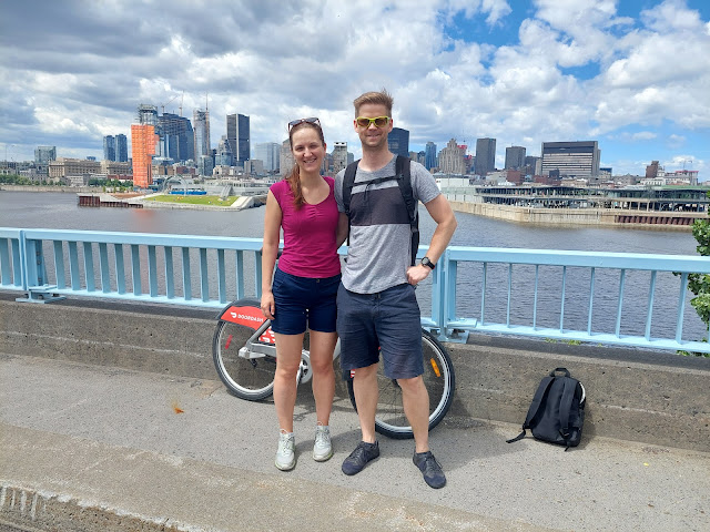
Exploring Montreal on a bike

Manhattan from Brooklyn

American breakfast with M&M (Martin&Mia)

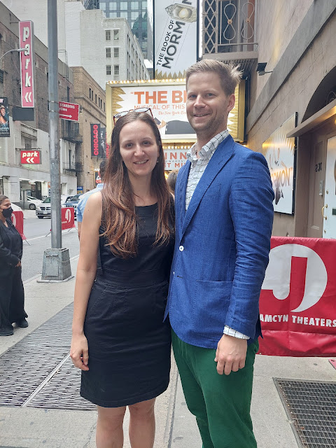
Before Book of Mormon


21 February 2021

Scott Alexander is back!

The best blogger under the Sun—Scott Alexander—is back after a short hiatus. His new blog is called Astral Codex Ten and hosted on Substack.

Scott is a blogger like no other. He covers a wide range of topics, so it’s actually very hard to describe the content. It’s best if you just dive in and start reading. Apart from eye-opening insights, he also had measurable impact on my life. I now mostly ignore news, politics or the latest online outrage. I also partly attribute my improved health to Scott.

To help you start reading his works, many people have compiled their short lists.

Apart from the popular posts, I’m especially fond of his (loose) series on Bayesian reasoning and predictive processing in the brain, so here comes a list that other people missed.

28 December 2020

You should have a hardware security key

I've been carrying this USB device with my keys for the last couple of months and you should be doing the same.


The security key on the photo is YubiKey 5 NFC and it makes my online accounts more secure by providing an additional login factor on top of a password.

As a side note, Orbitkey key organizer on the photo above is awesome too!


Multi-factor authentication

Many websites encourage you to use multi-factor authentication, however most of the available options are cumbersome to use. First you wait for the SMS code to arrive and if it doesn't arrive, you have to retry. Then you retype the code from your phone into the computer. Assuming you typed in everything correctly, you are logged in!

All the hassle aside, the SMS protocol is not very secure, so the effort doesn't even add that much value. A YubiKey is more secure and only needs a touch to be activated. Since I bought my YubiKey(s), I don't use SMS codes or similar complicated factors. It's both more secure and easy to use—a double win!

Google, Facebook or GitHub allow adding as many security keys as you want. It's important to have more keys, as your key can get lost or stolen. Actually, it's good to treat your hardware security keys as normal keys.

  • Have at least two, in case you lose one. Optionally, leave a spare key with a friend or in a safe storage.
  • If you lose your key, disable it on all accounts as soon as you can. (There's a difference from door keys where you need to change the door lock, here you just disable one key.)
  • Carry one with your normal keys, in case you need to login on the road. Also, my most frequently used YubiKey is permanently inserted in a USB port of my laptop.
One important difference is that it's okay to take a picture of your YubiKey and post it online while you shouldn't do it with your door keys.

I get it, but why should I care?

If you type in your e-mail into Have I Been Pwned?, you'll see all (known) data breaches that included your online accounts. This doesn't mean that hackers got access to your password but it's best to change it anyway. Depending on the strength of your password and security measures of the online service, it can take them from minutes to weeks of effort to reconstruct your password.

Another popular attack is phishing, where you end up on a wrong web address which looks identical to your bank or e-mail. The fake website is run by hackers, so once you type in your password they have it without any extra effort required.

In both data breach and phishing attacks someone else might know your password. Multi-factor authentication with a hardware security key protects your account, as your hardware security key is safely with you and a password on its own is not enough to login.


Which one should i buy?

An alternative to the black YubiKey shown above costing 45 euros plus taxes is the cheaper FIDO2-only blue YubiCo security key NFC costing 25 euros plus taxes. It should be sufficient for most people, thanks to the modern FIDO2 standard enjoying more support each day. 

The producer of all mentioned keys is YubiCo, the industry leader. Other companies make their own FIDO2 security keys but they aren't that much cheaper, so I'd just go with the industry leader. See also an article in New York Times for a more detailed comparison.

Android 7+ phone can act as a FIDO2 key but right now this functionality seems to work only for Google accounts. If it starts working for other accounts, you'll need one fewer key if you have an Android phone.


Password manager

People tend to use the same password for many online accounts at once, so a data breach or phishing attack on a single website allows hackers to access accounts of other online services. It's recommended to use a password manager which generates a special password for each account and stores it safely. You only need to remember one master password for the manager. For a longer overview of password managers, see the excellent article in NY Times.

A security key can provide extra security for your password manager. Unfortunately I only know of two alternatives. One free and complicated, the other paid and easy-to-use.

  • 1PasswordBitwarden a Dashlane support the FIDO2 standard but only in paid versions. Their family plans for 5 people are affordable though and offer a lot of handy features.

  • Using the PGP functionality (for PGP see the end of the post) of YubiKey, you can use the simple Unix utility pass, storing passwords in git and encrypting them via PGP. There are apps for Android and Windows, as well as browser extensions.

Note: if you are a casual internet user, you can stop reading now. The rest of the post is for advanced users who use SSH or PGP.


FIDO2 SSH key, stored on the device

This section requires OpenSSH 8.2 or newer.

Key generation

First set a PIN to protect the SSH key from being used if stolen. Despite N standing for number in PIN, your PIN can be a password with characters. Actually, you can set a simple PIN but use a strong SSH key password instead. It's your choice.

You can set the PIN using the command-line yubikey manager or the GUI version. Note that you only need to set the PIN once.

ykman fido set-pin

Then generate the key.

ssh-keygen -t ed25519-sk -O resident -f ~/.ssh/id_ed25519_sk

The key is stored on the device (that's the -O resident part) and also in ~/.ssh/id_ed25519_sk. The local storage in ~/.ssh is not necessary if you follow the next section and load the key using ssh-add -K.

Using the SSH key on another computer

Once at another computer, you need ssh-agent running.

eval "$(ssh-agent -s)"

You can also start ssh-agent every time you login. Here are some common setups.

Once ssh-agent is running, you can load the key. You will be asked for the PIN that you set earlier.

ssh-add -K


PGP key stored on YubiKey

For PGP, follow the excellent guide by drduh.


Tip: Disable OTP

By default, YubiKey prints out about 40 characters every time you accidentally touch it, which can get annoying. You can disable the OTP application which does that, as you probably won't need it. You can disable it in the desktop YubiKey manager or on the command line.

ykman config usb --disable OTP

13 September 2020

How I optimized my health

Note: This is a continuation of previous blog posts on histamine intolerance (part 1part 2part 3) and another one post histamine intolerance.

Short health history

  • 2000–2002: Asthma-like symptoms during running, which eventually made me quit competitive orienteering.
  • 2004–2009: Insomnia, mostly in winter or after alcohol (1 beer was enough).
  • 2010–2012: Moved to Sweden and soon experienced migraines with aura, for which I took many different pills and all of them only made it worse. Worst insomnia and stomach problems. Spent about 3 months on sick leave. Got diagnosed with histamine intolerance.
  • 2013–2014: Antihistamine medication relieved a lot of symptoms, but I had to stop taking it regularly because of side-effects. Spent another few months on sick leave. (blog postanother blog post)
  • 2015–2016: Stopped seeing doctors and started experimenting on myself. No longer histamine intolerant. (blog post)
  • 2017–now: Steady progress, every year I could eat more food, exercise more, sleep better, etc. I’d rate my health at 95% now.

(Non-)Measurable improvements

I prefer improvements that are measurable. Some changes might not look like improvements, for example gaining weight is considered bad, but I consider it great, as the gain has been mostly muscles. Similarly for heart rate while running, the higher the rate, the faster I can run.

Metric  201220162020
Weight (kg)677382
Heart rate (BPM, orienteering race)150165175
Falling asleep2:00  24:00  22:30
Sleep length5h6h6.5h+
Exercise per week0.5×1–2×3–5×
Podcast listening speed1.3×1.4×1.6×

I’ve also experienced improvements which are hard to quantify, for example better mental focus or not being tired in the afternoon. Even though these are hard to measure, they are very closely tied to sleep quality. If my sleep is great, I can also focus. In any case, here’s a list of other improvements.

  • I can now eat milks proteins and more fiber.
  • I can drink alcohol.
  • Better mental focus, no crash after lunch.
  • No painful migraines.

Not everything is perfect, though. Instead of taking too long to fall asleep I now sometimes wake up too early. See my Last.fm 2019 music stats, they start to pick up before 5 AM. My goal is to wake up at 5:30 AM.

Last.fm listening statistics for 2019


What worked

Since the last post in 2016, I’ve changed the following.

  • Moved back to Central Europe from Sweden, so I get much more sunshine.
  • I take fewer cold showers, because the shower water is not cold enough in Central Europe. I also practice less intermittent fasting, as I want to weigh more.
  • I’ve switched my exercise focus from cardio (orienteering, biking, ultimate frisbee) to strength training. I’ve also stopped stretching—the only noticeable change from this is more free time.
  • I’m now sleeping on a Japanese futon, the hardest bed on the market. It improved my sleep times and sleep quality.
  • Most importantly, I’ve made my diet more consistent thanks to a slow cooker and a big freezer. Diet makes for at least 80% of the whole improvement, so it deserves its own section.

Diet details

Through experimenting with supplements, I discovered that I need to focus on the following essential nutrients.

  • Vitamins: A, B*, D, K
  • Minerals: Potassium, magnesium, salt, iodine, selenium, iron
  • Amino acids: glycine
  • Other: nitric oxide

Getting enough (and not too much) of these from food makes for a diet very close to Perfect Health Diet. Below is a sample of my diet from the COVID-19 “lockdown”, when it was the most consistent.

  • Breakfast: 5 free-range eggs with pickled or fermented vegetables. Occasionally no breakfast.
  • Lunch: vegetarian meal from the restaurant downstairs.
  • Afternoon snack: dark chocolate, almonds, fruits, yogurt, protein bars.
  • Dinner: grass-fed beef organs or bone broth. With vegetables or potatoes on the side.

I know, I know, this diet has a lot of vegetables which are environmentally costly. They contain very few calories, require a lot of water, land and nutrients. They also require refrigeration to remain fresh. However, picking a diet which balances personal health with ethical considerations is not an easy task. I think I need to first read famous moral philosophers such as Immanuel Kant, Jeremy Bentham or Peter Singer before I can form an opinion that I can share publicly.

Ethical considerations aside, I think the Perfect Health Diet (PHD) is one of the easiest ways to get essential nutrients in optimal quantities. Some people might be able to make substitutions, but this diet should work for everyone. For example, PHD contains vitamin A mostly in the form of retinol and its esters. Another source are carotenoids, but they need to be converted first and some people have reduced conversion ability, such as myself. It’s a genetic mutation, so there’s not much you can do about it.

I wasn’t able to fix everything through the diet, though. For example, I need to supplement a lot of potassium. I went through 2.5 kg of potassium citrate in about a year, which makes for more than 2 grams of supplemented potassium per day. Some people say that modern food production reduces potassium content in our food. It could be also caused by poor absorption. It’s particularly annoying, as supplementing potassium is very tricky and cumbersome.

Histamine and methylation

I want to share one particular finding regarding histamine, perhaps it’s going to be useful to someone.

People diagnosed with histamine intolerance in Slovakia are given a brochure that emphasizes diamine oxidase (DAO) as the degradative enzyme of histamine in the body. However, other sources also mention histamine-N-methyltransferase (HNMT).

Once formed, histamine is either stored or rapidly inactivated by its primary degradative enzymes, histamine-N-methyltransferase or diamine oxidase.Wikipedia

Consequently, flawed HNMT activity leads to chronic forms of histamine intolerance.Wikipedia

In general, increased sensitivity against biogenic amines is due to a weakened enzymatic amine degradation caused by genetic or acquired impairment of MAO, DAO, histamine-N-methyltransferase (HNMT) function.Histamine intolerance and dietary management: A complete review, 2016 paper by Martin, Brachero and Vilar.

Histamine is Nτ-methylated by HNMT, as the name histamine-N-methyltransferase suggests. In 2015, after reading about methylation, I have slowly made methylation-related changes to my diet with great results. Some time in 2016 or 2017 I’ve learned about the connection between methylation and histamine and made my diet even more strict, which led to even better results.

In the spirit of health bloggers, I’ll now conclude that my symptoms were fixed by methylation and HNMT. Post hoc ergo propter hoc. Haha, just kidding, I can do better!

My diet is now rich in B vitamins, magnesium, collagen, and many other nutrients. These have plenty of other effects, so it’s hard for me to judge causality. In any case, people having histamine-related problems could try it out and see if it helps. All of this made me curious why histamine intolerance patients aren’t told about HNMT but only about DAO. For example, HNMT is active in the central nervous system, where DAO is not present, so focusing purely on DAO might not improve all symptoms.

Interestingly, the histamine intolerance brochure given to patients was written by the producer of the DAO supplement, who wants people to buy their product and has an incentive to hide information about HNMT. I’d still give them the benefit of the doubt using Hanlon’s razor: “Never attribute to malice that which is adequately explained by stupidity”. In this case it could be my own stupidity, since I’m not an expert.

If you’ve made it this far and are interested in methylation-related dietary changes, check out Chris Masterjohn’s methylation guide and his presentation on Methylation, MTHFR, and Histamine.

Doubts about modern medicine

Over the years, my opinion of medicine became gradually worse. In 2011, I thought that I have a condition that’s hard to diagnose and treat. In 2014, I was questioning the Swedish public and private system. In 2016, I shared Robin Hanson’s proposal to cut medicine in half, but added that I’m not buying it yet. Well, now I’m totally buying it. We spend too much on medicine.

If you want to challenge your believes, I recommend reading Robin Hanson’s article or his book The Elephant in the Brain (together with Kevin Simler). I also recommend the article When Evidence Says No, But Doctors Say Yes by David Epstein.

The early phase of COVID-19 is a great illustration of these ideas. People assumed that enough ventilators would save us all. However, early data showed that survival rate on ventilators was somewhere between 3 to 35%. Ventilators and their operation are very expensive, requiring intensive care from nurses and doctors, but they only save few people. Ventilators are used at a very late stage of the sickness when they cannot do much. Preventive measures such as social distancing and face masks are cheaper and more effective. However, they require participation from everyone.

Most money in medicine is spent on people over 60, when it’s too late for miracles. There are cheaper preventive measures such as exercise, good nutrition, better sleep, not smoking, etc., but these require participation from everyone.

I think it’s important to spread Robin Hanson’s message, but not because it would make us spend less money on medicine. The spending will continue, but perhaps people would start taking better care of their bodies if they knew that medicine can not do much.

Recommendations

There are many people in the better half of medicine and I have to thank them for a big part of my progress. I can recommend the following people for health advice. Some of their content is not free, but I highly recommend spending some money on valuable information.

Conclusion

I wish there was one simple trick but I failed to find it. I’ve counted about 15 micronutrients that I need to be cautious about and 5 daily/weekly habits. And all of these need to be correctly dosed, which is a lot of work.

Hopefully this is my last post regarding health. It took a few years—almost 2 decades—but now I can live life to its fullest.

11 April 2020

All models are wrong, but some are useful

Note: Also available as a PDF.

Radoslav Harman, my former statistics professor (and also one of my favorite people), is working on a stochastic model of COVID-19 in Slovakia. Below is a picture from my simulation of the model. Red/orange line is the actual number of new positive cases each day – the real data. Blue dots represent outcomes of the simulation, the darker the more frequent. The picture is made of out 200 runs for one particular setting of free parameters b0, α and prefix (their meaning and exact values aren’t important for now).

Simulation of daily new COVID-19 cases

On March 21, 41 people tested positive out of 440. The previous day (March 20), 13 out of 367 tested positive. With only only 20% more tests on March 21 we got 3 times more (41 versus 13) positive results! The model and my simulation predicted about 10 to 30 positive tests from March 20 to March 22. The simulation is clearly off around this time – it overshoots on March 20 and 22 and undershoots on March 21. How could we fix it? My suspicion is that the population tested on March 21 was qualitatively different, for example it could have contained a big group of people returning from abroad. Actually, this is exactly what happened on April 5, when a group of 35 people returning from Austria tested positive. April 5 is the second to last day in the graph and for this day the model underestimated the number of positive new cases by a huge margin.

The result of the model could be improved by providing information about where each tested person traveled and who they interacted with in the last few days (and this is exactly the type of information that needs to be collected for life to get back to normal).
All models are wrong, but some are useful. – George Box
The model is wrong about daily new cases, but actually being right about daily new cases is not its goal. It’s supposed to describe the behavior of the epidemic in the long term. The following graph is similar to the previous one, but contains cumulative/total cases instead. Also, it contains two more days. Again, the red line is the reality while the simulation is blue.

Simulation of total COVID-19 cases
It looks like this configuration of parameters b0, α and prefix fits the cumulative data fairly well, since the red line stays within the simulated blue zone (except for the last two days when we know that the tested population was somewhat special). As Rado said himself, right now the model admits two scenarios fairly different from each other: one where the disease is spreading slowly since mid-February and one with the disease spreading since the end of February, but much more rapidly.

Is such a model useful? Sure, it could be more precise, but at least it gives a range and that’s a start. I’d say that it’s fairly useful. And as always, we need more and better data.

Exponential-growth models no longer useful

Exponential growth has been mentioned a lot regarding epidemics and the spread of COVID-19. However, in countries implementing social distancing, exponential-growth models are so far from reality that they are no longer useful. And compared to the model above, they cannot be improved using more and better data.

Exponential functions are straight lines on semi-log graphs, so the total number of cases should form a straight line on a semi-log graph. Below is a picture of total cases in Italy on a semi-log graph together with the exponential function 220 ⋅ 1.145t, where t is the number of days since the 200th case.

Total confirmed cases in Italy on a semi-log graph.
The number of cases is not a straight line at all! Clearly, we haven’t applied enough logarithms, so let’s add one more log to the mix and plot it on a log-log graph. Note that now also the horizontal axis is log-scale.

Total confirmed cases in Italy on a log-log graph.
Now it looks much more like a straight line! For about 20 out of the 40 days plotted, it fits the function 2.5 ⋅ t3 which is the straight dashed line on the graph. That’s a polynomial and not an exponential function. Is it just a coincidence?

According to the paper Fractal kinetics of COVID-19 pandemic by Ziff and Ziff published in February 2020, the growth of active cases in China was much slower than exponential – roughly 0.0854 ⋅ t3.09 ⋅ e − t/8.9. Notice the exponent of 3.09 being almost the same as 3 for Italy, though the formula plotted above for Italy didn’t have exponential decay. There is another important difference – the two graphs for Italy contain total confirmed cases while Ziff and Ziff quantify active cases. In particular, active cases can decrease while total confirmed cases never decrease, since it’s the number of people who tested positive.

A few weeks ago, Slovak mathematicians Katarína Boďová and Richard Kollár looked at multiple countries using the same principles presented by Ziff and Ziff, and made a generalized formula for the number of active cases N(t) on day t (t = 1 is chosen as the first day with 200 active cases).

N(t) = (A/TG) ⋅ (t/TG)6.23 / et/TG
  • TG is a country-specific parameter – the average speed in days in which “the sick are removed from the system” (to stop spreading the disease).
  • A is a scaling constant.
  • 6.23 is not just some constant that fits the data but a root of an important equation according to the authors. We’ll have to wait for the manuscript to know more details.
On 2020-03-30, they made the following predictions for active cases in 7 countries.
Country TG A Max. cases Max. date
USA 10.2 72329 1 241 389 2020-05-08
Spain 6.4 3665 99 978 2020-04-12
Italy 7.8 4417 99 459 2020-04-12
Germany 6.7 3773 98 038 2020-04-14
United Kingdom 7.2 2719 66 082 2020-04-21
France 6.5 1961 53 060 2020-04-12
Iran 8.7 2569 51 773 2020-04-21

Scoring the predictions

On 2020-04-10, 11 days after the predictions, I’ve looked at the data to see how did the predictions do. However, I’ve disqualified France, since they first withheld information for multiple days and then reported all of it on 2020-04-04, making it unfair to anyone predicting trends. Slate Star Codex questions Iran’s data, but I haven’t investigated that, so I keep my rating for now.
Country Subjective rating
Italy ★★★★★
United Kingdom ★★★★★
Spain ★★★★★
Germany ★★★★
USA ★★★★
Iran ★★

Italy

The prediction (dashed line) is spot-on. Note that the green zone marks the data available at the day of prediction, so until March 29.
Active cases in Italy until 2020-04-09 together with the predicted trend

Spain

The original prediction (upper dashed line) was a bit pessimistic, but another curve with a slightly lower TG of 6.2 (versus the original 6.4) fits the data really well so far.

Active cases in Spain until 2020-04-09 together with the predicted trends

Germany

Germany, like Spain, at first looked like having lower TG of 6.3, but recently their patients are recovering really fast and the number of new cases is steady. It might mean that their TG got even lower but it could also mean that there is something wrong about the model.

Active cases in Germany until 2020-04-09 together with the predicted trends

USA

USA had the most pessimistic prediction and it’s good that the number of cases is smaller than predicted. I scored it highly (★★★★), because keeping the predicted TG but lowering the value of A by 15% is in line with the trend. However, USA is still before the first inflection point, so it’s too early to make any confident judgements and I’m not confident about my exact score either.
Active cases in USA until 2020-04-09 together with the predicted trend

For the sake of brevity I skipped the two remaining countries, but you can check their predictions on a web dashboard. The data is updated daily.

Discussion

The classic exponential-growth models have a key assumption that infected and uninfected people are randomly mixing: every day, you go to the train station or grocery store where you happily exchange germs with other random people. This assumption is not true now that most countries implemented control measures such as social distancing or contact tracing with quarantine.

You might have heard of the term six degrees of separation, that any two people in the world are connected to each other via at most 6 social connections. In a highly connected world, germs need also very short human-to-human transmission chains before infecting a high proportion of the population. The average length of transmission chains is inversely proportional to the parameter R0 (which you probably heard of).

When strict measures are implemented, the random mixing of infected with uninfected crucial for exponential growth is almost non-existent. For example with social distancing, the average length of human-to-human transmission chains needed to infect high proportion of the population is now orders of magnitude bigger. It seems like the value of R0 is decreasing rapidly with time, since you are meeting the same people over and over instead of random strangers. The few social contacts are most likely the ones who infected you, so there’s almost no one new that you can infect. Similarly for contact tracing and quarantine – it’s really hard to meet an infected person when these are quickly quarantined.

The formula N(t) = (A/TG) ⋅ (t/TG)6.23 ⋅ e − t/TG has two free parameters A and TG. One objection to the finding might be that with two parameters you can create many different functions, making fitting arbitrary curves easy. However, a simple analysis shows that A and TG only scale the graph of the function vertically and horizontally. The observation is left as an exercise to the reader. As a hint, here’s a picture of three functions t6.23/et, (t/2)6.23/et/2 and 2t6.23/et.


Further reading


Back to the first model

The model of Radoslav Harman is an explanatory model: it tries to explain the past. It estimates when the infection arrived to Slovakia and how fast it’s spreading since then. Also, it’s estimating how good the testing selection process is, whether we test too many people with common cold or flu instead of COVID-19 patients.

These three estimation goals are expressed as the following parameters of the model.
  • b0 is a measure of overall quality of the testing selection. That is, the greater b0, the better the efficiency of the system in restricting non-COVID-19 individual from testing. The smaller b0, the more non-COVID-19 individuals get tested.
  • α or γ2 describe the growth of infected cases. The model works both for polynomial growth (parameter α) and for exponential growth (parameter γ2).
    • α is the exponent in the polynomial growth function tα. It’s very hard to estimate TG for Slovakia, since we have few dead and recovered, so there is no support for exponential decay yet.
    • γ2 is the rate of exponential growth after March 12, when Slovakia implemented restrictive policies. Judging by the mobility report released by Google, March 12 seems to be the right choice.
  • tmax is the total length of the simulation. (My code instead uses prefix_length as a parameter and calculates tmax = prefix_length + days, where days is the number of days for which we have data.)
For each combination of parameters, we run multiple simulations. Each configuration of parameters receives a score based on how close it is to reality.
The code is on github, including visualizations and dashboards running on a web server. If you’d like to help in any way, feel free to get in touch.

Picture time!

Let me end with some pictures from the simulations. They confirm Rado’s claim that we cannot distinguish between start of the infection in mid-February versus end of February with faster spread. You can also view the visualizations online: polynomial and exponential growth.

The axes of the heat maps on the pictures show b0 and prefix length. The closer the color on the heat map is to yellow, the better a particular configuration matches reality. Notice that yellow color spans through the pictures, so we have plenty of fairly good configurations. There are two pictures for polynomial growth of t1.24 and t1.28, and one for exponential growth of 1.04t. So far, the scores of these three setups aren’t that different from each other, but we expect it to change in the coming weeks.

Heat map of errors for different b0 and prefix length, with growth of t1.24

Heat map of errors for different b0 and prefix length, with growth of t1.28

Heat map of errors for different b0 and prefix length, with growth of 1.04t

15 February 2020

Stávkovanie pred voľbami

Už platí moratórium na prieskumy, ale stávkovať na výsledky volieb sa paradoxne stále dá. Podľa Efficient-market hypothesis (EMH) by finančné trhy mali reflektovať všetky dostupné informácie. Stávkovanie je tiež finančný trh, čiže v stávkových kurzoch sú už započítané výsledky volebných prieskumov, ale aj ďalšie informácie z “ulice”. Neviem, ako veľmi sa slovenské stávkové spoločnosti približujú ideálu EMH[1], ale predvolebné udalosti určite ešte zahýbu kurzami. Stávkové kurzy sú tak čiastočnou náhradou za chýbajúce prieskumy v posledných 14 dňoch. Ja ich budem brať určite do úvahy pri rozhodovaní, komu dám hlas.

Kurzy tesne pred začiatkom moratória na prieskumy

Zároveň sa dá stávkovanie použiť na emocionálne hedžovanie. Stavil som si na to, že SNS sa dostane do parlamentu, lebo si to neželám.
  1. Ak sa SNS nedostane do parlamentu, znamená to oveľa menšiu šancu pre zlý vládny variant, čo vynahrádza stratené peniaze.
  2. Ak sa SNS dostane do parlamentu, asi bude zlá vláda, ale aspoň som vyhral peniaze. Preto to nazývam emocionálny hedž.
V prípade výhry za polovicu kúpim uhlíkové kredity cez carbonfund.org a za druhú polovicu prispejem jednej slovenskej politickej neziskovke. Napríklad slovensko.digital, ale môžete dať aj iné návrhy.


[1] Slovensko je malá krajina a tak sa volebnými kurzami dá manipulovať pomerne ľahko a ešte ľahšie v lokálnych voľbách. Takto o župných voľbách v Banskej Bystrici písalo sme.sk:
Samozrejme, sú aj situácie, keď preváži stávkovanie srdcom. Napríklad pred poslednými župnými voľbami, kde bol Ján Lunter jasným favoritom so širokou podporou, fanúšikovia Mariana Kotlebu sa na sociálnych sieťach hecovali stávkovaním na Kotlebu a dokonca z neho na chvíľu urobili (kurzového) favorita.